Thursday, 16 December 2010

Tic Tac Idea/ Inspired by Bows
I've realised I chose the wrong garment, yes I wanted to experiment more with it as it was plan and white but I believe the garment is not appropriate for my theme military so by gathering this image below I came out with an idea foe my garment.

This top persuades me to change my garment into something I can use as military wear.

This high heel inspires me with military colours perhaps camouflage.

By looking at this different types of waist coat, gave me the idea to change my garment into a waist coat military wear.

Am inspired by the simplicity of it top.The creamy colour creates a calm and warm atmosphere, while the flowers with the black edge creates an elegant style with the add of the creamy beads.
Love Bows :)
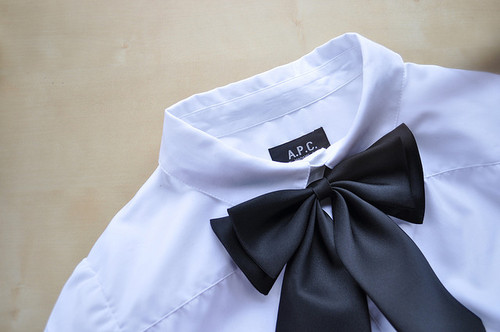


I think Bow represents elegance, simplicity, and style. I love them because they come in variety of beautiful colours, shapes and have lovely appearance.
1st Garment/ Manipulation on fabrics

I have to get a garment from a charity shop so I went and bough this garment. I chose this one because is white and plan; which will allow me to do loads of experiment with it.
Tutorial with Chris
Today i had a section with Chris and he advised me to research on :
- Shape
- Colours
- Military
which will link to my previous post cards inspiration and help me improve my work.

A sketch of my original garment.

This is what am plaining to do for my garment

This are some shape experiment that I have done by looking at my Tate Modem post card by using different types of fabric with different fabric. I've realised this experiment aren't enough just to
cut out shapes.

I just cut out some leafs fabric to experiment and manipulated the fabric into a shape.

Experiment/manipulation with some plastic fabric. I had to used stapler to help keep the shape wanted as the material had a characteristic of being silky making it hard to work with while manipulating it.

Here are my little manipulating work on fabric. Overall, the I find the experiments unsuccessful because i worked in small scale, I think if I worked in a larger scale in my experiment would have help me understand and manipulate the fabric better.The last experiment is more appealing for me, perhaps because I used vivid paint colours which mad the appearance of the experiment more effective.
Tate Modem Research
I went to Tate Modem hoping to be inspired and discover the theme for my garment.

Created by Maria Helena Vieria Da Silvia who was born in Portugal in 1902 died in 1992 . She worked in France and Brazil and was known for her expressive abstraction in post was Paris. Her works always retained a strong basic reference to visible world for example many of her painting depict labyrinthine intender space with multiple and complex lines of perspective.

Created by Ray Lichtenstein who was born in 1923 and died in 1997. It is appealing how Lichtenstein uses an illustration based on books to create a sculpture presenting violence and war through it representation in popular culture. The steel mesh suggest a smoke cloud while also alluding the Benday dots used in the printing of comics as well as newspaper which is familiar motif in Lichtenstein works.
Post cards

I chose this post card as I founded it appreciative that it contained military in it. The post card contains catchy colours "white, orange,red and black as background which I could use for my experiment later on. What interest me were the royal solders on the white horses that had some fascinating bottoms shape on the military cloth (unfortunately the buttons are not showing clearly.) I will consider incorporating the buttons shapes in my garment so that I will keep my initial interest of military in it.

What attracts me in this post card, is the use of nature colours (contains everyday colours), light blue which we see in the sky, grey/white in clouds, and silver in metal. The 2 metal shapes reminds me of the military dress found at the V&A museum which motivated me into a military theme. The white shape with the holes shape is inspiring me experiment with print making later on.
Juxtaposition

Juxtaposition: is when to contrasting things are placed together to create something out of that. By looking at Katy Perry's second image juxtaposition is being used. At the left side she's wearing a suit in black/ white and wearing a short dress at the right side which creates a contrast.
Louise Bourgeois

Louise Bourgeois was a famous artist who was born on the 25th December 1911 and died in 31 May 2010 She was a renowned French-American artist and sculpture who was best known for her contribution to both contemporary and modern art. One of her most know piece is the "Crouching spider sculpture" titled Moma which is resulted in her being nicknamed the Spider-women. She is recognized today as the founder of confessional art.

As I went to Louise Bourgeois exhibition at the Hauser and Wirth Saville; the crouching spider was my favourite piece by her simply because I was amazed by the scale of the piece which was huge and overwhelming.
V&A and Hauser and Wirth Room

Evening dress created by Giovanni Versace(1946-97); made with leather and crystals at the top of the dress, and the cross at the left side of the dress.


This piece got my attention because of the juxtaposition used. This dress was made my a man named Rifat Ozbert who was born in Turkey (1953-92). He was trained at Central Saint Martins, Ozbert has often used ethic surface decoration in his designs. This 1990;s layered look has dramatic waistcoat inspired by native American costume. It make a black and white composition over a sheer organiser tunic.

Bullet Hole was created in 1992 made of wood, steel and grass.

This piece was hand sewing, it was made from cotton and was already printed out in the material. This piece captured my attention due to the black and white colours that where used which I find simple and effective as it grabs attentions by inviting you into the piece.

That I fined interesting was how 3 different section were combined together and created a nice piece of pattern.
Dazed Digital

The New York art space kicks off its annual exhibition of upcoming creative talent. This piece was is by Moma , I find the lighting of the photograph as well as the colours used interesting as It brings a bright and fresh atmosphere. There can be a contrast; as by looking at the photograph it is focusing at the middle girl who can be stereotyped as a nerd due to the glasses worn and also because it looks like it is her first time smoking as all the girls surrounding her are starring at her.

Nelly Ben Hayon present her new sci-fi installation at Manchester's Science Festival,design is crucial part of storytelling and for her, that engage narrative extends to explaining complex scientific processes. Her portfolio includes a scheme for generating dark matter in your sink; explorations of brain plasticity in snails, and an installation to recreate the experience of the first ten minutes of a space rocket lift-off sequence. 'Super K Sonic Boooum 2 Gold' is an installation mimicking the experience of a sonic boom at Japan’s Super-Kamiokande Neutrino Observatory. I like how she her piece attract you to the central where the miners are, to achieve this she used perspective effective.
,

ASIA BEAUTY EXPO: PETER GRAY
The acclaimed hair stylist brings Peter Gray's sculptural hair show to Tokyo with the help of Nicola Formichetti and Dazed menswear editor Robbie Spencer, among others. This picture is effective due to the black and white style which takes us back to the classic, elegant styles. The posture used by the model tells it all " Yes am a lady am exclusive and unique with my hairs style". Although the hair styles might not be seen as elegant , because of the clothe worn the whole picture crates an elegance atmosphere.
Subscribe to:
Posts (Atom)