My finial idea is based on a combined idea from the V&A museum, Camouflage research and Alexander Mc Queen cloth line. From the V& A museum, I introduced the use of Juxtaposition from the dress with (sticks) into my work. I incorporated the idea of camouflage from my research and my inspiration in the previous post also into my garment. The leaf idea gain from Mc Queen worked with my theme as I wanted my garment to have a fresh sense of atmosphere. As an outcome I think the whole idea of camouflage and juxtaposition worked well but I believe if I had time I should have sewn the sleeve on the waistcoat instead of stapling it.
Ideas for my garment form
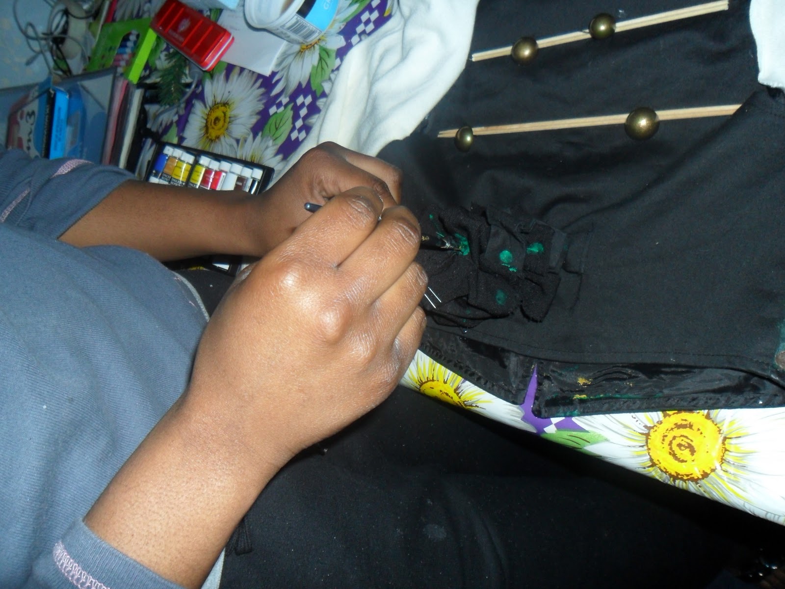
Addition on Garment
Leaf:Idea from Alexander Mc Queen.
Juxtaposition idea from the V&A museum:white sleeves added onto waist coat.
The though of potato print might sound weird but it is a useful technique which I've learnt in class and decided to add into my garment. To make Potato print Firstly, I had to draw the shape that I wanted my print to print on a piece of paper ,then copy it out on Styrofoam and cut it out. I then had to add paint onto the Styrofoam and use the Styrofoam to print on top of the material chose. I chose black fabric as my new garment is black, so I had to make sure I experimented on a black fabric to see if it would have worked or not. I realise I have to add white paint on my garment before the paint on top of the Styrofoam as the black fabric took away the colours vivid preventing it to be seen properly.
Shape for the potato print
Styrofoam being cut out to the shape wanted
Outcome
As you can see the left side is much darker than the right side due
to the fact I added white before the purple paint on the right side.
I was told to research a contemporary fashion artist and Alexander Mcqueen was the one I first though of.
Lee Alexander McQueen, was born on the 17 March 1969 and past away on the 11 February 2010. McQueen died days before London Fashion Week He was a British fashion Designer and couturier best known for his in-depth knowledge of bespoke British tailoring his tendency to juxtapose female strength and sensuality with fragility in his collections, as well as the emotional power and raw energy of his provocative fashion shows.
His Final show: Right before Alexander McQueen's death he had an eighty percent unfinished autumn/ winter collection, 16 pieces, presented in Paris during 2010 Fashion Week. Fashion editors picked his final designs. Editors said the show was hard to watch because it showed how McQueen was obsessed with the afterlife. The clothes had a medieval and religious look. Basic colours that were repetitively used were red, gold and silvers with detailed embroidery. His models were accessorized to show his love for theatrical imagery. "Each piece is unique, as was he," McQueen's fashion house said in a statement that was released with the collection. Below are some of his Amazing collections :
After looking at his cloths line and reflected on it, I have realised the leaves/flowers are used to make the dresses more sombre and unique. I will introduce leave in my final garment to create a different texture in my garment.
Alexander Mc Queen: This dress is an inspiration to me. This is because it contains multi-tone Samurai print, which relates to my idea of using a printing technique on my garment.The dress has several shapes which I have noticed acsend in size. my thoughts on this are that when the garment is wornm, the smaller shape at the top will make the top part of the body look smaller which will give an impression of a curvy body.
The colours used are multi-tone gold, red and blue. The gold is used to emphasise the importance of a Samurai, as well as wealth. It can be suggested that the artist used gold to bring back the classic style of the 19th century.After reflecting on this, I realised that red is used to give a much vivid appearance to the dress making it more appealing.
The round neck creates a classic and feminine look for the dress. The capped sleeves are shaped upwards, perhaps to give a much wider shoulder: again helping the body look much curvier.
Military
Military fashion began after war world 2, as there was no job except working for the army. The only cloths people had was their military clothe given to them , so from then ,military fashion began.
Military Camouflage
Military camouflage became an essential part of modern military tactics after the increase in accuracy and rate of fire of weapons during the 19th century. Until the 19th century armies tended to use bright colors and bold, impressive designs. These were considered to daunt the enemy, foster unit cohesion, allow easier identification of units in the fog of war, and attract recruits.
British Military
British Camouflage
Military fashion today
Other Military Wear
Indian
Chinese
Italian
Ranks
Other ranks
Indian Ranks
Chinese Ranks
After my research I sat down and came out with new ideas for my garment with are found below.
Garment Ideas
Am planing to have a camouflage print with lots of bows at the
left side and 2 big bows to cover the pockets.
Or
t
Or I could get a plan mack and work with it for my final piece.
Or i could get a bandanna and print camouflage on it as my final piece
Before starting my screen print I had to make sure I had variety of paper fabric, wallpaper, newspaper ect...
I had to draw out the shape I wanted on a piece of paper then copy it on a transparent paper to use it often by cutting it out. I had to used Drafting film to measure the correct size for my screen. I then chose my ink colour that I wanted to use (orange). I had to find squeeing to fit the width of my screen, fix the screen to the table ans screwing the hooks. Moreover I had to line my drofting film stencil underneath so that the edges wont become expose. I then had to get my paper newspaper ect ready to place them underneath the screen and stencil. i had to use a card to scoop the ink onto the tope boarder to dob every along then width of the screen. I had to make sure that I firm pressure on the screen without stopping on holding the squeegee with both at 45 angle to the table and drag it. I had to repeat all this stages for all the print i printed which are below ...
Triangle are found in my Tate Modem postcard which I've decided to use as my print screen.
This piece was printed out in brawn paper. It doesn't look
attractive perhaps because of the brawn paper used which make the piece more dull.
This print worked for me because the wallpaper is brighter and has a design in it(boat)
The orange print, printed out well and work well with the paper.
I printed this out of newspaper, I don't like it because it looks like
the print is fading away due to the background which take away the brightness of the orange colour.
Annette Messager is a French artist who was born in 1943. She is known mainly for her installation work which often incorporates photographs, prints and drawings, and various materials. Messager attended the École des Arts Décoratifs in Paris, France but was eventually was asked to leave because she spent her time at museums and movie theatres instead of going to school. Most of her works are based on Children view.
Below are some of her work
Messager said:" I like to tell stories ... children stories most mysterious
most of her works last for decodes is based on toys and children childhood.


